Visual inconsistency in side panel menu
Objective:
To create a consistent and unified side panel design across the Aladia application, ensuring a seamless and intuitive user experience.
Pain Point
Currently, side panels differ in layout, styling, and structure. This lack of consistency disrupts the user’s flow, increases cognitive load, and makes the interface feel fragmented. Users may struggle to quickly adapt when navigating between different sections of the application.
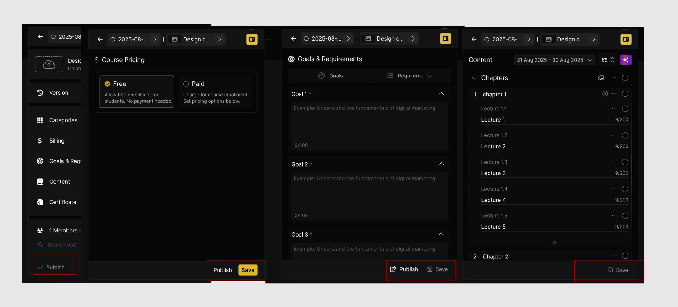
Solution
Establish a standardized design pattern for all side panels within the application. This includes defining a uniform structure, typography, spacing, iconography, and interaction behaviors within the design system. By aligning side panels under one cohesive guideline, we can reduce visual disturbance, improve usability, and create a smoother, more predictable user journey.
Please authenticate to join the conversation.
Completed
Bug & Fixes
9 months ago

Ravindra Singh
Subscribe to post
Get notified by email when there are changes.
Completed
Bug & Fixes
9 months ago
Ravindra Singh
Subscribe to post
Get notified by email when there are changes.