Improve UX UI for Handling 500 Platform Errors
To enhance the user experience when encountering server errors (Error [500]), we need to modernize the UX and UI following current market standards. The goal is to make error handling clear, friendly, and actionable for users.
Requirements / Guidelines:
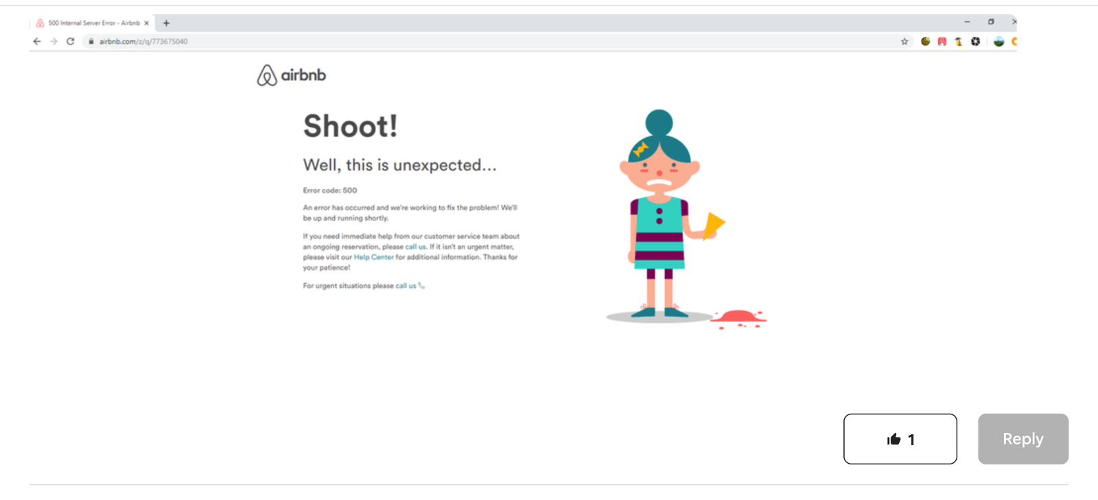
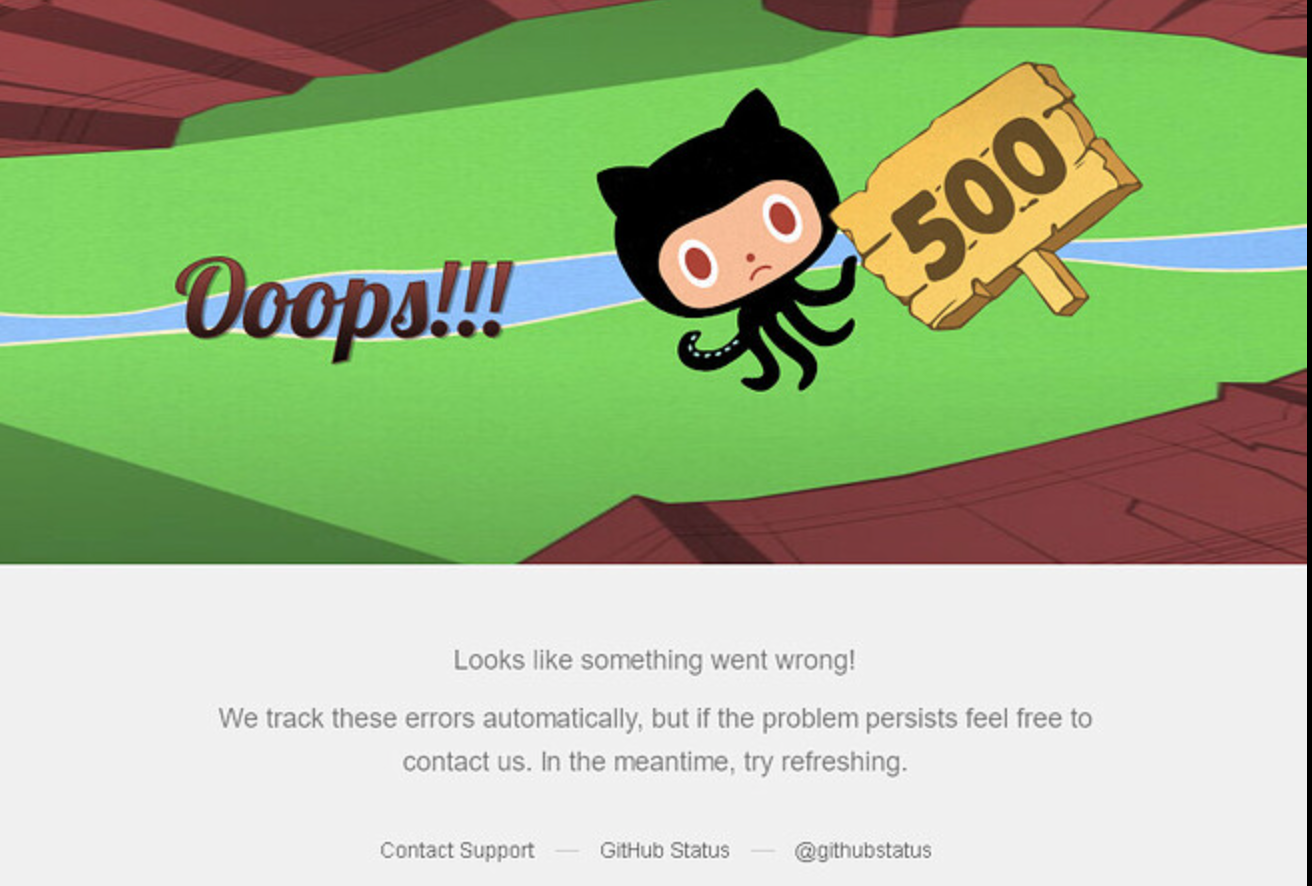
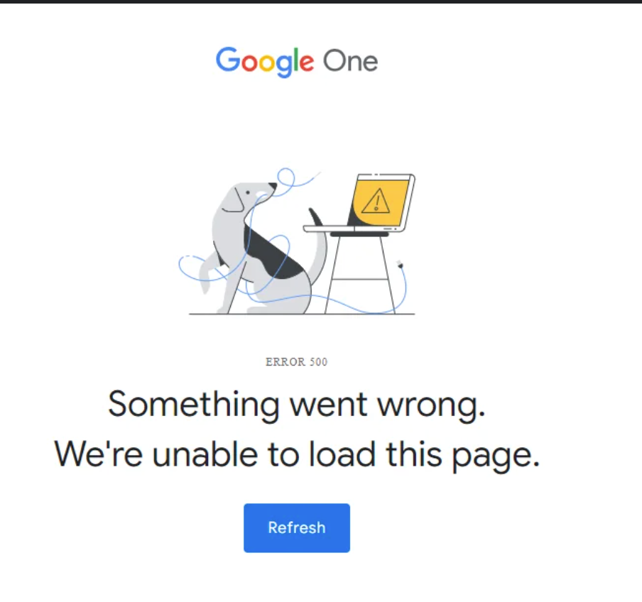
Clear & Contextual Error Messaging
Avoid vague messages like “Something went wrong.”
Provide a simple explanation, e.g., “We’re experiencing a temporary server issue.”
Retry / Recovery Options
Include a button for users to retry the action or navigate back to the homepage or marketplace manually.
Friendly Tone
Use human-readable text.
Ensure a visually calm UI (avoid alarming red unless necessary).
Include illustrations or icons to improve user understanding and engagement.
User Support / Documentation
Provide a link to a help page with next steps or troubleshooting guidance.
Some Examples

Please authenticate to join the conversation.
Completed
Ui Ux Audit
8 months ago

Mattia Vaccari
Subscribe to post
Get notified by email when there are changes.
Completed
Ui Ux Audit
8 months ago
Mattia Vaccari
Subscribe to post
Get notified by email when there are changes.