Improve information distribution in payment charts
The information in the payment chart carousel shows redundant information that could be arranged in a more coherent and orderly manner.
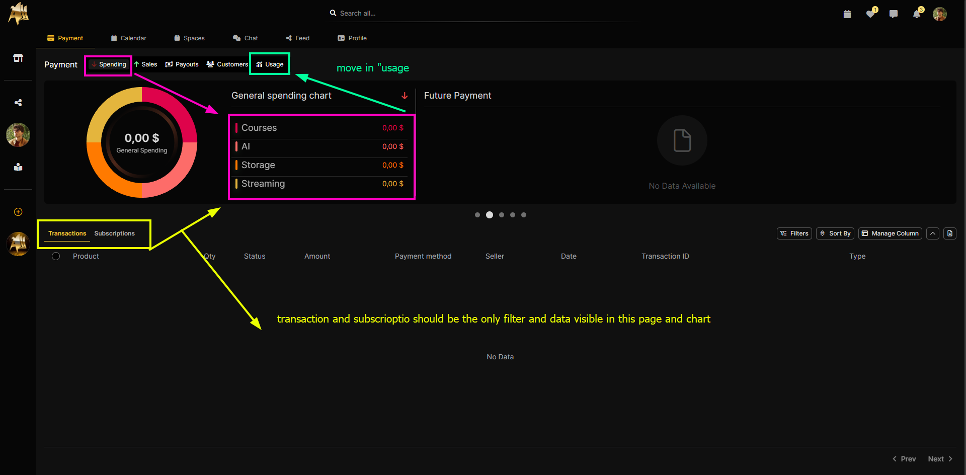
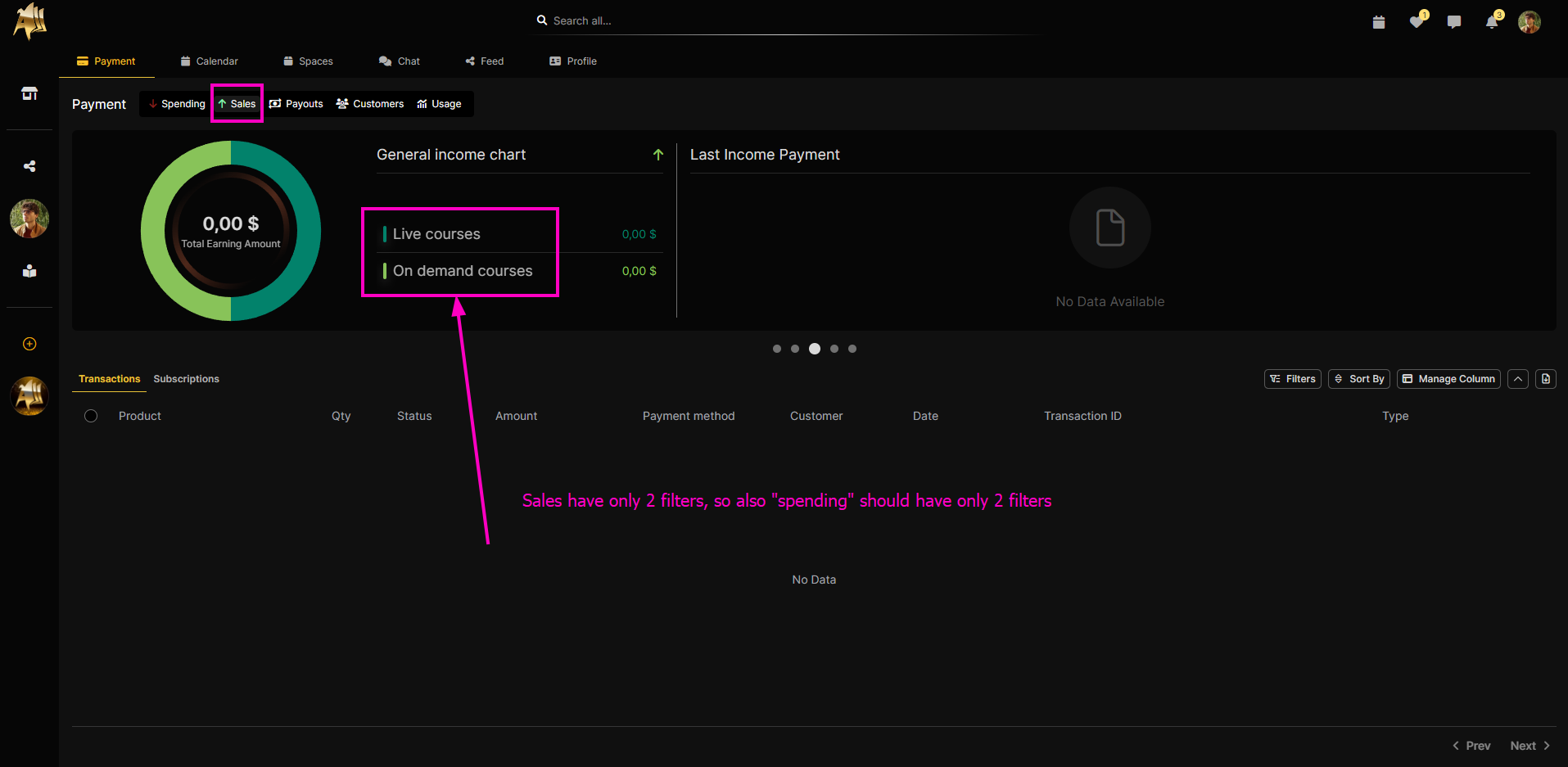
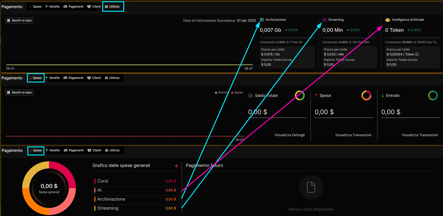
The goal of this task is to redesign the screen to consolidate data into a single, clear, and intuitive view, eliminating redundancies and allowing the user to understand their consumption at a glance.
Ensure that other charts on the page (e.g., the expense donut chart) use the new panel as their sole source of data, eliminating discrepancies.
Verify that the new layout is significantly clearer and easier to interpret than the previous one.
Please authenticate to join the conversation.
Not Required
Bug & Fixes
High Priority
10 months ago

Daniele Cosentino
Subscribe to post
Get notified by email when there are changes.
Not Required
Bug & Fixes
High Priority
10 months ago
Daniele Cosentino
Subscribe to post
Get notified by email when there are changes.